
The radio buttons are a fundamental components in user interfaces, allowing users to make a single selection from a more-than-one set of options. The history of how radio buttons looked like reflects the revolution of user interfaces from very early computers to the era of smartphones. In this article, I wanted to quickly jump into the origin and development of radio buttons. Although the information available on the internet isn’t much, I found one interesting discussion on Stackoverflow which started my curiosity towards the development of radio buttons.
The Naming of Radio Buttons
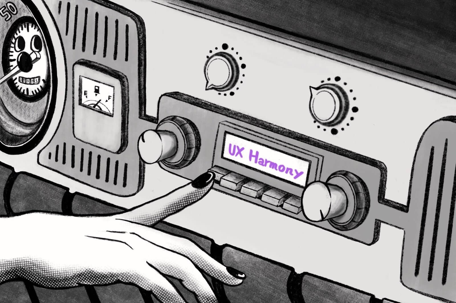
First, let’s explain why radio buttons are called “radio buttons.” Someone posted very comprehensive answer to that question on Stackoverflow which explains this question – well, the reason is that they work like the buttons on old car radios, where pressing one button would cause the others to pop up. In the context of UI design, the concept of radio buttons is the same – a radio button allows only one choice, meaning that once you press it, other choices are canceled.
What’s interesting is that the buttons on old car radios weren’t necessarily round, at least from what I found on the internet. Actually I’ve got one childhood memory that involves these old car radios – my grandpa used to have a Fiat 126p and the way the radio worked was the same, but the shape wasn’t rounded – it was rectangular. So, why are radio buttons rounded? It seems like the name “radio” is based on its function, not its shape. It was not easy, but I examined a few early personal computers UI to look for an answer. I watched a few Youtube videos with early personal computers, starting from Xerox to Windows 95, to at least try to understand which personal computer was the first to introduce rounded radio buttons.
The History of Radio Buttons
Let’s start with the UI design of Xerox Star, a computer released in 1981 that already introduced a concept similar to radio buttons. Although not rounded, but there was the idea of “single choice” that involved rectangular shapes with labels inside.
Two years later, Apple’s Apple Lisa OS developed its own GUI, also incorporating the concept of radio buttons, but in a rectangular shape as well. Windows did not have GUI until 1995, so my next thought was Macintosh. Bingo! It seems that in 1984, the Macintosh OS was the first to introduce rounded radio buttons, you can see them on this Youtube video (7:54) or in an iframe below.
Original Mac OS demo on Youtube, Credit: Computer Clan
In the 1980s, apart from NeXTSTEP, Apple, and Windows, all other operating systems used rectangular radio buttons. Perhaps Apple’s designers wanted to clearly distinguish between radio buttons and checkboxes, leading them to choose a circular shape. Later, Windows designers also opted for a circular shape, so Windows 1.0, Windows 2.0, and Windows 3.0 all used rounded radio buttons, you can watch a tour of Windows 1.0 on this Youtube video (1:11) or in an iframe below. So that’s it, I think the UI designers at Apple wanted to distinguish radio buttons and checkboxes and decided to design them in a different shape. If you have any better ideas let me know in the comment section below!
Tour of Windows 1.0 UI on Youtube, Credit: Computer Clan
What shape should I choose for my radio buttons?
Even though it has been almost half a century since the development of the original Mac, I’ve noticed that even today, some people still make the mistake of using incorrect shapes to represent different types of buttons in their webdesign. I believe that using the right shape is very important for enhancing accessibility and user experience. So unless you are working on a custom button (on and off switcher for example), please keep your radio buttons rounded. I think after nearly 50 years, a lot of people got used to them.